Loading
Novo Nordisk

NovoPen Tutorial
Prototype

Introduction

We were hired by Novo Nordisk to create a functioning application that could detect and transfer dosage logs from Novo Nordisk’s NovoPen® 5 Plus, a reusable insulin pen equipped with NFC (Near Field Communication) technology to an Android mobile device.

Client

Novo Nordisk is a global healthcare company with more than 95 years of innovation and leadership in diabetes care.
Novo Nordisk Logo

My Role

As the Senior UX Designer on the project, I provided visual design, prototypes, copywriting for instructional content, and video asset creation for the in-app tutorials. Throughout the engagement I additionally assisted with research efforts, generating the interview guide and administering the test.
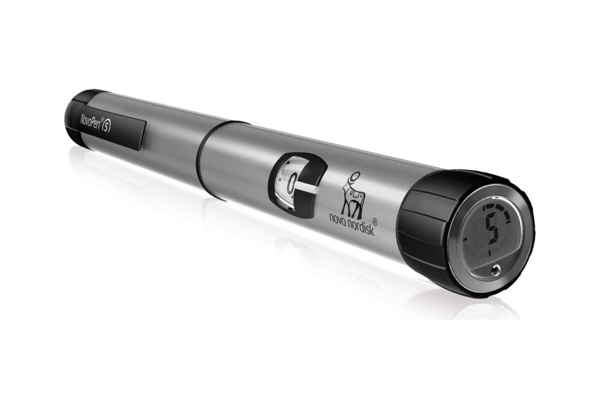
Novo Nordisk NovoPen® 5 Plus; insulin administration device
The design effort sought to improve the instructions for first time users attempting to sync their NovoPen with their Android device.
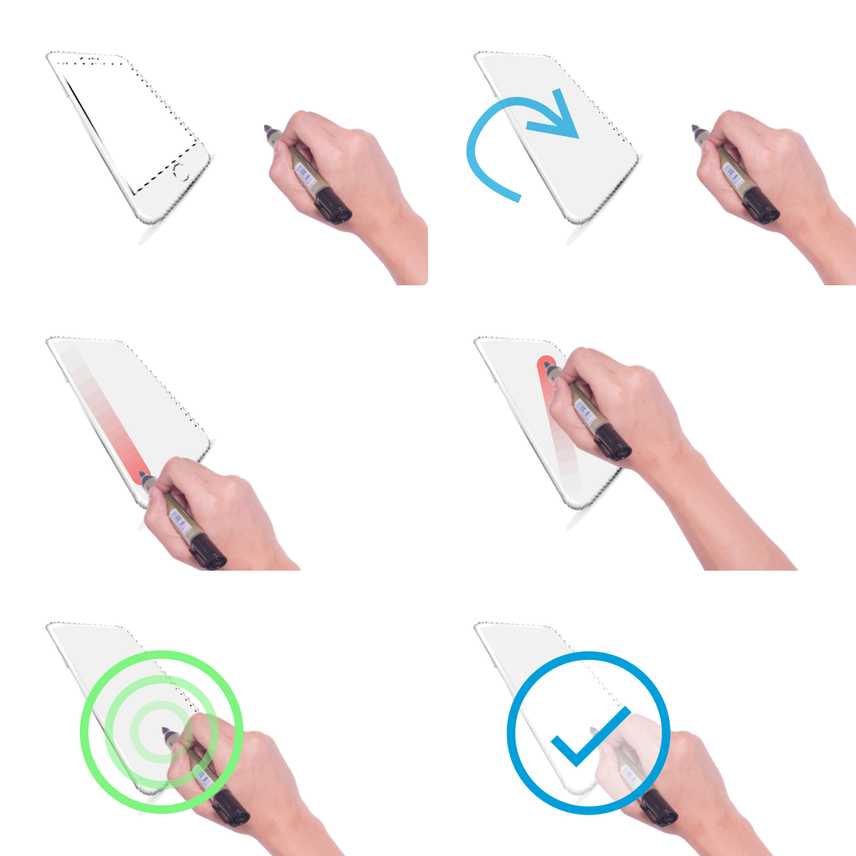
GIF sequence of a pen dragging across a mobile device
Original instructional GIF sequence

Defining the Problem

The patient’s primary barrier to transferring dosage data from the pen to his/her device was understanding how the pen needed to interact with the device itself. As a result of phone manufacturers placing NFC sensors in different areas, the nature of having to sync the pen in close proximity to the back of the phone contradicted conventional behaviors associated with wireless syncing.

We found ourselves challenged by hardware limitations forcing us to develop creative UX solutions.
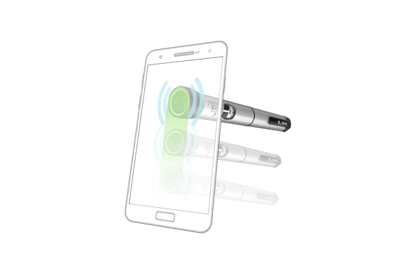
Novopen being dragged across a semi-transparent mobile device
Improved visual for syncing motion

Identified Issues

1. Users do not read the instructions or watch the tutorial video
  • How can we provide a better tutorial for first time users?
  • How do individuals prefer to learn knew tasks on their phone, specifically when handling the pen device?
  • Are the instructions worded in a coherent way?
  • What type of users prefer reading the instructions, watching a video tutorial or trial and error?
2. Individuals are pulling the pen away too quickly and not fully establishing a connection with the NFC
  • How can we instruct users to slow down?
  • What feedback mechanisms can we provide to help users successfully locate and sync the NFC?
3. Users do not understand what they did wrong when connection fails
  • What are the most common errors encountered by a users?
  • What should the tone of error messing be for a patient?
  • How can we encourage success without frustrating the patient?
After identifying opportunities for improvement, we were able to begin a new design exploration app and video tutorial.
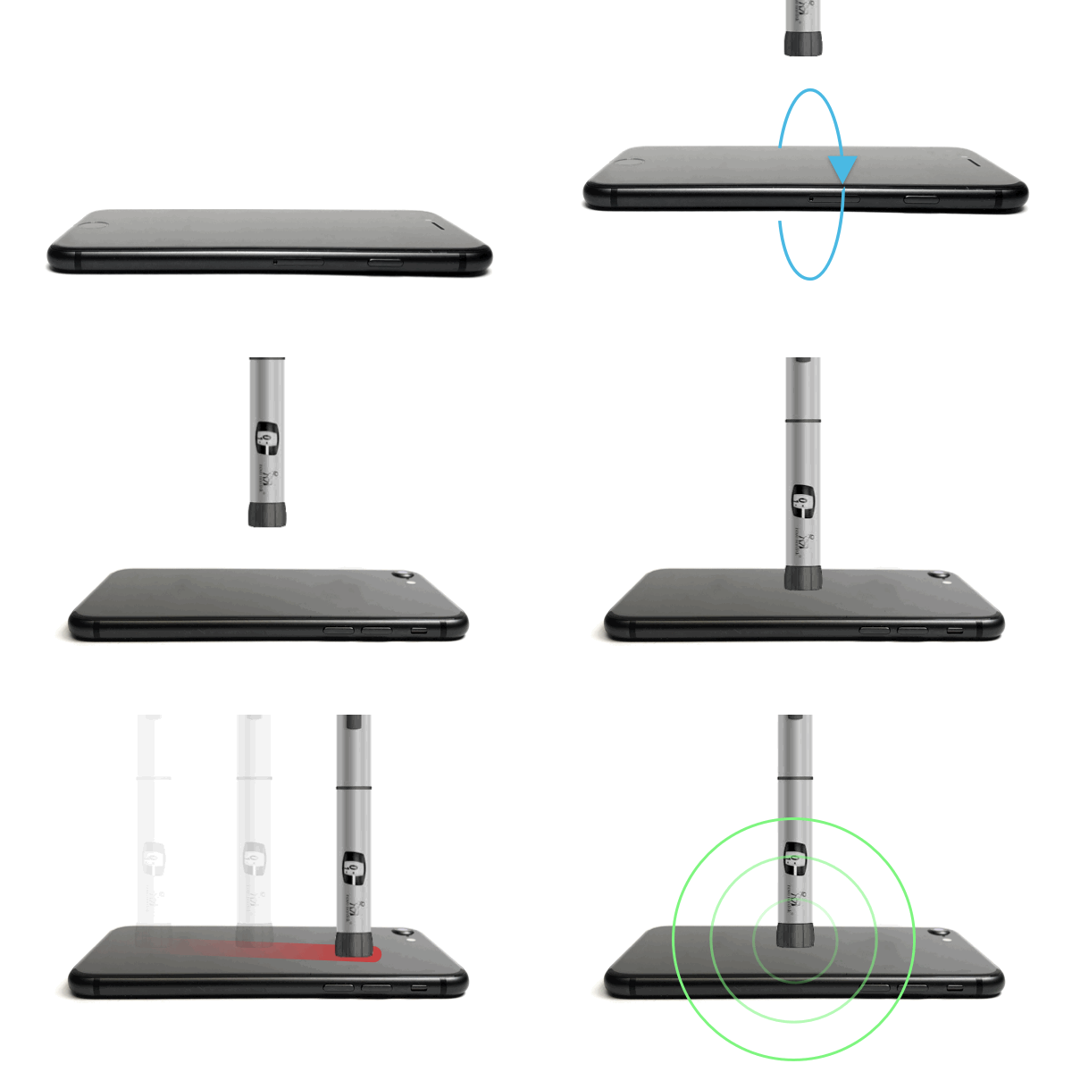
GIF Sequence flipped over and Novopen being dragged across the back of the device with a checkmark
Improved GIF sequence

Defining User Types

Due to not conducting prior research I was hesitant to label this section personas; however, throughout the testing of the prototype we discovered 3 distinct ways users preferred to learn

  • I learn by reading - Participants carefully study content on the page, reading every word. These individuals were more likely to read error messages and seek visual confirmation by having the screen face upwards. 
  • I learn by watching - Participants prefer watching an instructional video. Most individuals would watch the entire video before beginning the task. These users paid close attention to audio queues, mostly approaching the sync process by flipping the phone on its back.
  • I learn by trial and error - Participants did not read instructions and immediately gravitated to the primary call to action. Their behavior when syncing was mixed many repeatedly failing to sync without reading the reasons why.

Design & Validation

Affinity Diagraming

Evolution of Product

The previous design solution featured a single animated GIF which tested poorly. 100% of users failed to make a successful connection without additional instruction from the moderator. Several participants became extremely frustrated even abandoning the task.

The project provided the opportunity to solve unique problems that extended past the screen into the patient’s physical space.
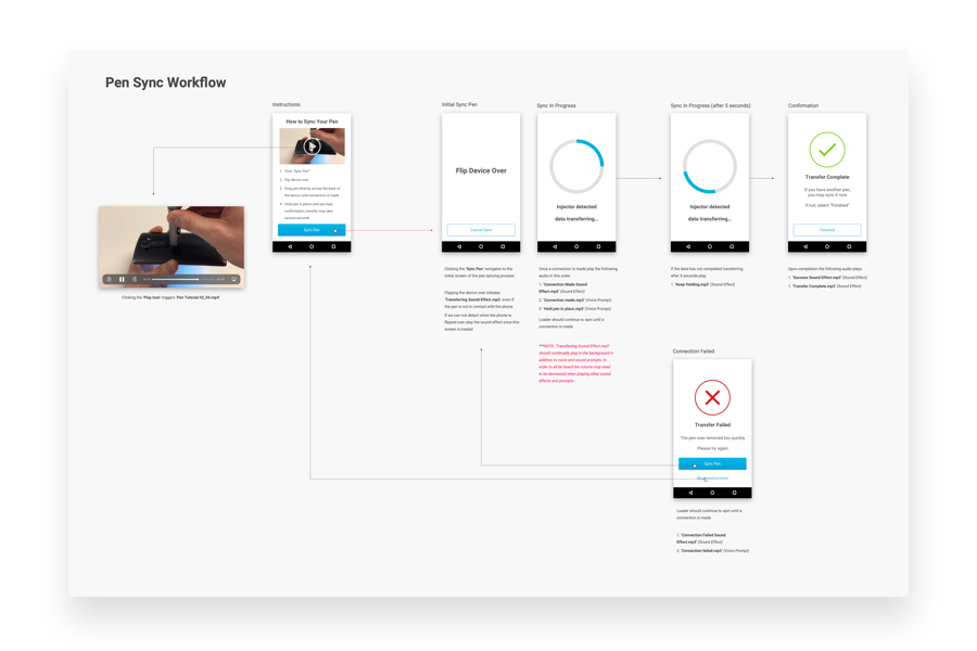
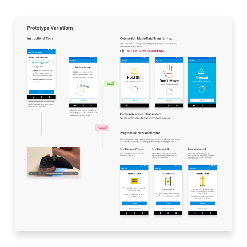
Pen Syncing workflow and UX documentation
Original documentation for development

Feedback & Iteration

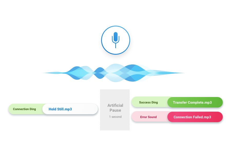
  • Provide several audio queues including voice prompts and sound effects. This solution had the potential to be ineffective due to the phone being muted when performing the task or the customer having a hearing impairement.
  • Some people wanted to see the screen when they were syncing. By providing the user with a screen that indicated when syncing had begun and completed we were able to accommodate the preference
  • Participants did not like to read. We reduced the copy down to 3 steps and highlighted words like “Slowly.” We additionally repeated the instructions on the sync page.
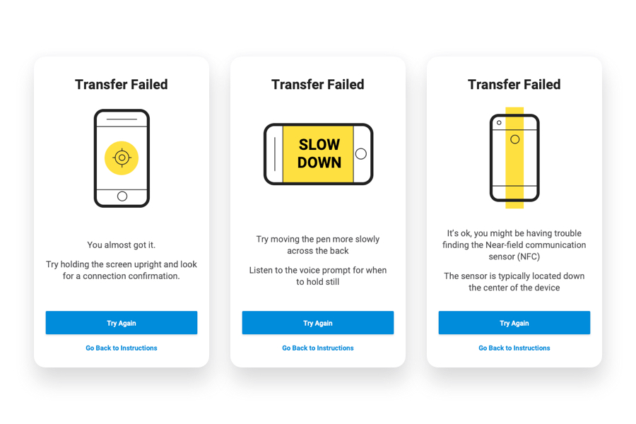
  • Participants continually encountered the same issues, as stated previously. We created progressive error messaging that would play in order from most common to least common.
    1. Pulling pen away before data has transfered - “You almost got it. Try holding the screen upright and look for a connection confirmation. Listen to the prompt for when to hold still”
    2. Moving too quickly - “Try moving the pen more slowly across the back. Listen to the voice prompt for when to hold still.”
    3. Not being able to locate the NFC - "It's ok, you might be having trouble finding the Near-field communication sensor (NFC). The sensor is typically located down the center of the device"
NovoPen Sync Tutorial
Diagram of voice messaging and audio alerts
Audio mapping for engineers
Improved error messaging and visual queues for synicing a Novopen
Design enhancement documentation
Sample of error messaging mobile screen comps
Improved error messaging

Results

The final prototype received +80% pass rates, with nearly all participant passing their first time. Those unable to connect and sync their pen on the first attempt, were able to quickly diagnose the problem with the help of our newly implemented error messaging.

Final Thoughts

Tackling hardware limitations with design led solutions paved the way for solving contradictory behavior associated with wireless syncing.  By providing visual and auditory feedback throughout the syncing process, we not only improved the first time experience of learning, but guaranteed a reduction of frustration felt by diabetes patients.

This project stretched my capabilities as an experience design, exposing me to video production, sound UX, motion design, and assisting in validation, making it one of the most diverse engagements I have had the pleasure of being apart of.